Monthly Archives: October 2012

Windows Phone Toolkit - September 2012 Release

A few astute people (@Patric68@scottisafool) have noticed that we pushed out the September 2012 release of the Windows Phone Toolkit.  This was a soft launch, quietly pushed out because we’ve been going like crazy with bug fixes, prepping for Build and doing a whole host of things and I really wanted to get a build out that had the latest fixes and improvements without blocking on all the paperwork. That’s agile baby!

What’s New

Branding

It’s now just the “Windows Phone Toolkit”.  Honestly “Silverlight for Windows Phone Toolkit” was too much of a mouthful and new developers targeting Windows Phone often don’t know of the Silverlight underpinnings.  We’re slowly transitioning all branding in the source to the shorter version.

CustomMessageBox
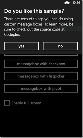
Sample CustomMessageBox Image

CustomMessageBox is a new control that makes it easy to create, well, custom message boxes that look and feel just like the default ones on the phone.  I did a little write-up of it last week in my blog post, “Welcome CustomMessageBox to the Windows Phone Toolkit”.

Rating

Sample Rating Control Image

Rating is another new control that does exactly what it says, provides a rating control that matches the Windows Phone UI.  Expect a blog post on using it soon but it as always you can see it in action by downloading the sample application from CodePlex.

Transition Effects

There are new transition effects that make it even easier to match the Windows Phone UX.

  • SlideInEffect – Ever notice when you’re in a Pivot or Panorama on the phone in one of the native experiences , say the People Hub, how the items in a list slide in on a separate animation as you swipe back and forth?  It’s subtle but adds a nice level of polish to the whole experience and now it’s super easy to add to your application as well.  There is a new attached property, toolkit:SlideInEffect that you set on each item in your DataTemplate that controls the order in which elements slide in:
    <DataTemplate>
        <StackPanel Margin="0,0,0,17" Width="432">
            <TextBlock Text="{Binding LineOne}" 
                       TextWrapping="Wrap" 
                       Style="{StaticResource PhoneTextExtraLargeStyle}"/>
            <TextBlock Text="{Binding LineTwo}" 
                       TextWrapping="Wrap" 
                       Margin="12,-6,12,0" 
                       Style="{StaticResource PhoneTextAccentStyle}"
                       toolkit:SlideInEffect.LineIndex="1"/>
            <TextBlock Text="{Binding LineTwo}" 
                       TextWrapping="Wrap" 
                       Margin="12,-6,12,0" 
                       Style="{StaticResource PhoneTextSubtleStyle}"
                       toolkit:SlideInEffect.LineIndex="2"/>
        </StackPanel>
    </DataTemplate>
  • FeatherTransition – Another common effect seen on Windows Phone is a “feathering” in of the controls on a page such as when you launch the mail app.  Notice how the items on the page feather in from top to bottom.
    <!--TitlePanel-->
    <StackPanel Grid.Row="0" Margin="12,17,0,28">
        <TextBlock Text="{StaticResource ApplicationTitle}" 
                    Style="{StaticResource PhoneTextNormalStyle}"
                    toolkit:TurnstileFeatherEffect.FeatheringIndex="0"/>
        <TextBlock Text="turnstilefeathereffect" 
                    Margin="9,-7,0,0" 
                    Style="{StaticResource PhoneTextTitle1Style}"
                    toolkit:TurnstileFeatherEffect.FeatheringIndex="1"/>
    </StackPanel>

Distribution / Installation

We’ve taken a new approach to distribution this time and gone “all-in” on NuGet as the official way to install the toolkit.  We’ll no longer be supporting an MSI-based installer as it’s not very maintainable or discoverable.  NuGet is built into Visual Studio 2012 and is fast becoming the de-facto standard for installing packages and if you haven’t already installed the plug-in for Visual Studio 2010 I highly recommend it.

As always you can still either download the source as a zip or from the source control on CodePlex and compiling the assembly yourself.

Bug Fixes

No release is complete without bug fixes and we have roughly 25 of the top user voted bugs fixed in this release.

Feedback

As always we love feedback, bug reports, creative uses and ideas.  We have more plans for the toolkit in the near future as well so stay tuned!
Welcome CustomMessageBox to the Windows Phone Toolkit

A big welcome to CustomMessageBox, a new control to the toolkit which is exactly what it sounds like, a customizable, Windows Phone-UI compliant, easy to use message box offering the following features:

  • Native look & feel including font sizes, layout, alignment and animations
  • Ability to display full screen or to only consume as much space as needed
  • Very simple “basic” mode with ability to easily extend it to complex scenarios
  • Customizable buttons without needing to re-template

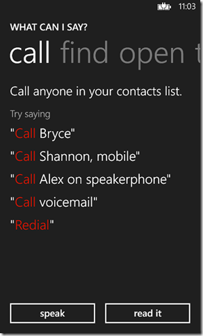
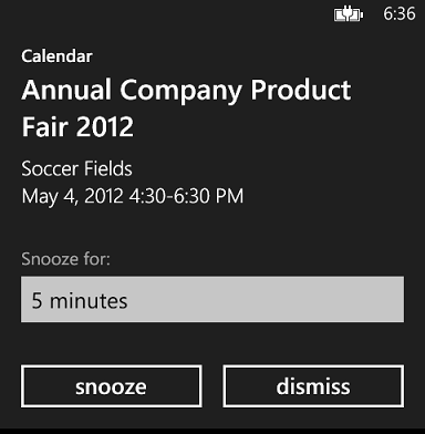
Here is what it looks like, from the basic (a message and some buttons) to the complex (a full screen message box with an embedded Pivot):

imageimage

Getting Started

As of today (9/30/2012) you’ll need to download the latest source from CodePlex and recompile the toolkit assembly to use it but we’ll soon have an updated NuGet package for your convenience. As usual add a reference to the Microsoft.Phone.Controls.Toolkit.dll to your project and add the toolkit XML namespace to the top of your XAML:

xmlns:toolkit="clr-namespace:Microsoft.Phone.Controls;assembly=Microsoft.Phone.Controls.Toolkit"

Basic Usage

The basic usage is very similar to the default MessageBox and how you’re probably used to using dialogs in other UI platforms; set some properties, call Show(), handle the event that is raised when the user returns from the dialog.

Possible values to customize are:

  • Caption – sets the title caption of the message box
  • Message – the actual message to display to the user
  • LeftButtonContent, RightButtonContent – the buttons that appear on the bottom of the dialog, if you omit the text then the button won’t be shown.

To handle the user’s selection hook up the Dismissed() event and look at the e.Result value which is of type CustomMessageBoxResult indicating which, if any, button was tapped. If the user presses the back button vs. making a selection the result will be None.

Finally to kick-off the whole process call Show(). Show() is non-blocking so be aware that any code you put after the Show() call will run before the user has made a selection.

By default the the message box only takes up as much space as required but you can force it to full-screen by setting the property IsFullScreen to true.

Simple Example

To recreate the first message box in the screen shot do the following in code-behind:

CustomMessageBox messageBox = new CustomMessageBox()
{
    Caption = "Do you like this sample?",
    Message = "There are tons of things you can do using custom message boxes. To learn more, be sure to check out the source code at CodePlex.",
    LeftButtonContent = "yes",
    RightButtonContent = "no"
};
messageBox.Dismissed += (s1, e1) =>
    {
        switch (e1.Result)
        {
            case CustomMessageBoxResult.LeftButton:
                // Do something.
                break;
            case CustomMessageBoxResult.RightButton:
                // Do something.
                break;
            case CustomMessageBoxResult.None:
                // Do something.
                break;
            default:
                break;
        }
    };
messageBox.Show();

The title caption, message and buttons are configured, the Dismissed() event is assigned a handler and finally the Show() method is called to kick off the party.

Taking It Up A Notch

That’s all well and good but where is the real “custom” part of the CustomMessageBox? That comes in with the Content property where you insert your own content into the overall layout. You can define your extra content in either code-behind or as a XAML resource and then set it to the Content of the CustomMessageBox.

The content area exists below where the Message is displayed yet right above the buttons.

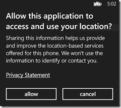
Let’s say we want to recreate this dialog:

image

Via Code-Behind

One way to go about it would be to create all the custom content inline at the time of invocation:

HyperlinkButton hyperlinkButton = new HyperlinkButton()
{
    Content = "Privacy Statement",
    Margin = new Thickness(0, 28, 0, 8),
    HorizontalAlignment = HorizontalAlignment.Left,
    NavigateUri = new Uri("http://silverlight.codeplex.com/", UriKind.Absolute)
};
TiltEffect.SetIsTiltEnabled(hyperlinkButton, true);
CustomMessageBox messageBox = new CustomMessageBox()
{
    Caption = "Allow this application to access and use your location?",
    Message = "Sharing this information helps us provide and improve the location-based services offered for this phone. We won't use the information to identify or contact you.",
    Content = hyperlinkButton,
    LeftButtonContent = "allow",
    RightButtonContent = "cancel"
};

The HyperlinkButton is created in code, tilt effect is set on the HyperlinkButton and to hook it together the HyperlinkButton is assigned to the Content property.

Via XAML

Another approach is to create it as a DataTemplate in either the page or application resources and when you configure the dialog set the ContentTemplate property which may prove easier for more complicated templates.

<DataTemplate x:Key="HyperlinkContentTemplate">
    <HyperlinkButton Content="Privacy Statement"
                        Margin="0,28,0,8"
                        HorizontalAlignment="Left"
                        NavigateUri="http://silverlight.codeplex.com/"
                        TargetName="_blank" />
</DataTemplate>

Now the code-behind looks like this:

CustomMessageBox messageBox = new CustomMessageBox()
{
    Caption = "Allow this application to access and use your location?",
    Message = "Sharing this information helps us provide and improve the location-based services offered for this phone. We won't use the information to identify or contact you.",
    ContentTemplate = (DataTemplate)this.Resources["HyperlinkContentTemplate"],
    LeftButtonContent = "allow",
    RightButtonContent = "cancel"
};

More Samples

You can find more examples, including the source to the “What Can I Say?” screenshot I showed above, in the Toolkit Samples project which you can either get via downloading the latest source or looking at it directly on CodePlex.

As always feedback is appreciated via either comments here or on CodePlex. We review each piece of feedback and we do get to them, if sometimes a little later than we’d like. Our goal is to make it so you can focus on writing your application vs. having to recreate the UI you see on the phone.